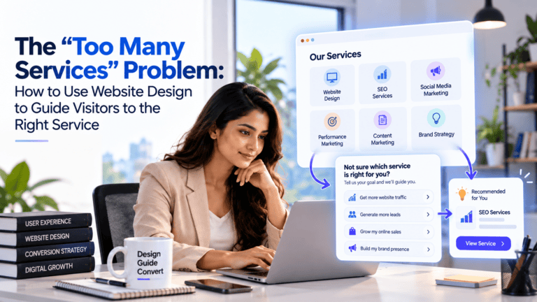
The "Too Many Services" Problem: How to Use Website Design to Guide Visitors to the Right Service
Most B2B companies think of website structure as a navigation problem. Which services go in which dropdown, how many items appear in the menu, whether the about page sits in the header or the footer. These are real decisions but they are not where most of the visitor’s orientation actually happens.
A visitor lands on a page and within the first three seconds they are forming an impression. Not from reading the navigation. From looking at the page. The layout, the visual hierarchy, what appears at the top of the screen before any scrolling, and crucially the website banner design at the top of the page, these are the elements doing the heaviest communication work before the visitor has read a single full sentence.
For multi-service B2B companies specifically, this matters enormously. The banner design is the first moment the visitor has to understand what this company does and whether it is relevant to their situation. Getting it wrong at that moment produces a visitor who scrolls politely and leaves. Getting it right produces a visitor who immediately recognises their situation and reads further.
Why Visual Hierarchy Does More Communication Work Than Copy
Website banner design in the context of a B2B service company is not primarily a branding decision. It is a communication decision. The banner communicates, before the visitor reads anything carefully, the following things:
- What type of company this is
- Who it appears to serve
- Whether the visitor is in the right place
Those three impressions form from the visual composition, the headline size and placement, the imagery or absence of it, and the colour tone of the banner before the copy is actually read. A design that communicates generic professionalism without specificity sets up the copy to do recovery work rather than reinforcement work.
The visitor who arrives at a banner that feels immediately relevant reads the copy to confirm their impression. The visitor who arrives at a banner that feels generic or unclear reads the copy to find out whether they are in the right place, which is a less committed and less confident reading posture.
What Good Website Banner Design Achieves for Multi-Service Companies
For a company offering multiple services to multiple audience types, the website banner design needs to achieve something specific: it needs to make the visitor feel addressed without making the company seem narrow.
That is a harder balance to strike than it sounds. The natural response to “we serve multiple types of clients” is a banner that says something universally applicable, which ends up saying nothing specifically useful to anyone.
The approaches that work:
Lead With the Problem, Not the Company
A design that opens with a named problem rather than a company description immediately creates recognition in the visitor who has that problem. “Still losing qualified leads despite spending on ads?” is a banner that speaks to a specific situation. “A leading digital marketing agency delivering results for businesses worldwide” is a banner that speaks to nobody specifically.
The named problem approach works particularly well for multi-service companies because different problems can be rotated or split-tested without changing the underlying design. The visual structure stays consistent. The headline copy changes to address different visitor types.
Use Visual Hierarchy to Separate Primary Services
For companies where different services genuinely need different visual treatment, a website banner design that uses sectioned layout, colour differentiation, or visual weight to indicate which services are primary and which are secondary helps the visitor navigate without reading everything.
A banner with two or three visually distinct zones, each with a brief label and a relevant outcome statement, tells the visitor where they belong within the first scan of the page. The visitor in zone one reads zone one content. The visitor in zone two reads zone two content. The navigation work happens visually before any text is processed carefully.
Make the CTA in the Banner Specific
Most B2B website banners have a CTA that reads “Get in Touch” or “Learn More.” Both CTAs ask the visitor to take an action without telling them what they are committing to or what they will receive. For a multi-service company where the visitor is still orienting, that vagueness reinforces the sense that the company is not sure which type of visitor it is talking to.
A specific CTA in the banner design tells the visitor what they are being offered: “Book a free website audit,” “See how we work with B2B companies,” “Get a free conversion review.” Each of those anchors the visitor’s next action to something concrete enough to evaluate.
The Visual Elements of Website Banner Design That Affect Conversion
Beyond the headline and CTA, several visual elements of website banner design directly affect how visitors respond to a multi-service B2B website.
Element | What It Communicates | Common Mistake |
Headline size and placement | What the most important message is | Headline too small, company name too prominent |
Subheading | Who this is for and what changes | Subheading repeats the headline rather than adding specificity |
Imagery | The type of client being served | Generic stock photography of generic business settings |
Colour contrast | Which element the visitor should look at first | Low contrast between CTA and background, button not visible immediately |
White space | Confidence and clarity | Overcrowded banner trying to communicate too much at once |
Social proof element | Others have trusted this company | Trust signals absent from the banner entirely |
Each of those elements is a decision, and the decisions made in website banner design collectively determine whether the visitor’s first impression creates relevance or confusion.
The imagery decision deserves specific attention. A multi-service B2B company that uses generic corporate photography in its banner, stock images of handshakes, office buildings, or diverse teams in a meeting room, communicates nothing specific about who it serves or what it does. Imagery that reflects the actual type of work being done, the type of client being served, or the outcome the service produces, does considerably more communication work without a single additional word.
How Banner Design Connects to the Rest of the Page Structure
Website banner design does not work in isolation. It sets up expectations that the rest of the page either fulfils or fails to fulfil.
A banner that promises a specific outcome needs a page body that demonstrates how that outcome is produced. A banner that segments visitors by type needs a page structure that actually takes those visitors somewhere relevant. A banner with a specific CTA needs a post-click experience that matches the promise of the CTA.
The most common disconnect on multi-service B2B websites is a design that creates a specific impression followed by a page body that delivers generic content. The visitor who was primed to engage by a relevant banner arrives at a generic service description and loses the confidence that the banner created.
For a b2b website development agency working on a multi-service company, the banner and the page body below it are designed as a single communication unit rather than as separate design elements. The banner creates the relevance. The page sustains it. The CTA converts it. That sequence needs to hold together at every step.
What Weak Website Banner Design Looks Like in Practice
Most multi-service B2B websites have one of three banner problems:
The everything banner: The banner tries to communicate all the services simultaneously. Multiple headlines, multiple sub-messages, multiple CTAs competing for attention. The visual result is a banner that communicates effort without communicating clarity. The visitor’s eye does not know where to go first.
The brand-first banner: The company name and logo dominate the banner. The headline describes the company’s identity (“Award-winning digital agency since 2010”) rather than the visitor’s situation. The visitor who came with a problem is shown a company that is proud of itself rather than a company that understands their problem.
The passive banner: Technically functional, visually inoffensive, and completely unmemorable. Generic headline, stock image, “get in touch” button. The banner does not actively confuse the visitor but it does nothing to engage them. The conversion rate from the homepage is low not because the banner is wrong but because it is doing almost no persuasive work.
All three of these banner patterns are fixable through deliberate website banner design that starts from the visitor’s situation rather than from the company’s preferred self-presentation. The question that should drive every banner design decision is: what does the visitor who is most valuable to this business need to see in the first three seconds to know they are in the right place?
Applying This to a Multi-Service Restructure
A b2b website development agency rebuilding a multi-service website typically approaches the website banner design after the structural decisions have been made: which services are primary, which audience types are most valuable, and what the conversion path looks like for each.
The banner is then designed to serve the structural decision rather than to make an independent aesthetic statement. If the structural decision was to lead with a specific primary service, the banner reflects that service’s buyer situation and outcome. If the structural decision was to segment by client type, the banner creates two or three visually distinct zones for each type.
Banner design done this way is less about making the website look good, though it should do that too, and more about making the visitor’s first experience of the website feel immediately relevant to their situation. That relevance is what keeps the visitor on the page long enough to read the content that eventually converts them.
Conclusion
For multi-service B2B companies, website banner design is where the visitor’s decision to stay or leave is made. Not the navigation. Not the service descriptions. The banner. The three seconds after the page loads determine whether the visitor’s attention is held or lost.
Getting the design right means making deliberate decisions about what the most valuable type of visitor needs to see first, building the visual hierarchy around that decision, and connecting the banner to a page structure that sustains the relevance it creates. That sequence, from banner to body to CTA, is the conversion pathway that b2b website design best practices are built to produce and that a specialist b2b website development agency is best placed to execute correctly.
If your website banner is not converting visitors the way the traffic volume suggests it should, BizEmporia works with B2B companies to design and build websites that make the right visitor feel immediately addressed. Book a consultation through the website.
frequently Asked Questions
Three things in order: what type of company this is, who it serves specifically, and whether the visitor is in the right place. A banner that communicates all three clearly in the first visual scan keeps the visitor reading. One that communicates any of those things vaguely tends to lose the visitor before they engage with the copy.
One primary CTA with specific language about what the visitor receives when they click it. A secondary CTA is acceptable if the visitor types are genuinely distinct, such as "For growing businesses" and "For enterprise teams," but both should be specific rather than generic. Multiple equally prominent CTAs create decision paralysis at the moment the visitor is most primed to act.
Yes, significantly. Imagery that reflects the actual type of client being served or the type of work being done communicates specificity without additional copy. Generic corporate stock photography communicates nothing specific and can actively undermine the credibility of specific copy sitting next to it.
The banner should be updated whenever the primary audience, primary service, or primary value proposition changes materially. Beyond that, testing headline variations within the existing banner design is often more productive than a full visual redesign, because it produces data about what is resonating rather than a single bet on a new approach.
Trying to communicate all services simultaneously. When the banner tries to speak to every visitor type at once, it ends up creating a cluttered visual that speaks compellingly to nobody. Prioritising the most valuable visitor type and designing the banner primarily for that visitor, with secondary paths available below the banner for others, consistently produces better conversion outcomes.