
Why Having Too Many Services on Your Website Is Quietly Costing You Clients
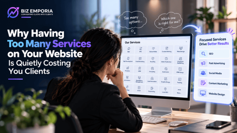
There is a particular kind of website that looks impressive at first glance. A long service list, dropdown menus with six or seven categories, a homepage that talks about being a “full-service partner for businesses of all sizes.” The team is proud of it. The agency that built it charged a fair amount.
And yet the enquiries are thin, the leads are poorly qualified, and sales conversations keep starting with the prospect saying they were not entirely sure what the company does.
That disconnect is one of the more expensive problems in b2b website design best practices that almost nobody names directly. Too many services on a website is not a sign of capability to a cold visitor. It is a source of confusion. And confusion does not convert.
Why Listing Every Service Feels Right but Works Against You
The instinct makes complete sense from inside the business. The company genuinely offers all of those services. Leaving something out feels like leaving money on the table. What if a prospect needs a service and does not know the company offers it?
The problem is that this logic is built entirely from the business’s perspective, not the visitor’s.
A first-time visitor does not experience a long service list as comprehensive capability. They experience it as a decision they did not come prepared to make. Which of these applies to me? Is this a specialist or a generalist? What do I do next? Those questions do not get answered by reading more of the list. They get answered by leaving and trying a competitor whose website makes the relevant service immediately clear.
This tension sits at the core of b2b website design best practices for multi-service companies: reflecting breadth while giving each visitor the immediate sense that their specific need is understood. Most websites lean entirely toward breadth and pay for it in conversion rate.
What Actually Happens in the Visitor’s Mind
The Paradox of Choice
More options do not make visitors feel better equipped to decide. Past a certain number of options, people feel less confident and more often choose not to decide at all. On a B2B website this means visitors who arrived with a genuine problem leave without enquiring, not because the company could not help them, but because the website made confirming that too hard.
The Generalist Impression
When a visitor sees a company offering web design, SEO, paid advertising, social media, content marketing, email campaigns, PR, and video production, the impression formed is rarely “this company can handle everything I need.” It is closer to “this company does a bit of everything, which probably means they are not exceptional at any of it.”
This damages B2B conversion specifically because B2B buyers are making decisions with professional consequences. They need evidence of genuine expertise in the area that matters to them, not a demonstration of broad capability. A company that is genuinely strong across many disciplines can still trigger the generalist impression through poor presentation. That is a b2b website design best practices problem, not a capability problem.
The Unclear Next Step
Multiple services without clear navigation logic produce multiple unclear next steps. Should the visitor book a call about web design or about SEO? Fill the contact form for a specific service or the general enquiry form? Unclear next steps are one of the most consistent conversion killers in any b2b website design best practices audit, regardless of industry or company size.
The Real Cost of Website Confusion
Problem | Cause | Business Impact |
Poorly qualified leads | Website does not filter by visitor relevance | Sales team wastes time on bad-fit prospects |
Sales calls starting with “what do you do?” | Website does not communicate specialism | First call does orientation work instead of selling |
Low conversion despite good traffic | Visitors cannot identify their relevant next step | Ad spend and SEO effort partially wasted |
Inconsistent enquiry quality by service | No service-specific conversion paths | Some services significantly underperform commercially |
Each of those problems has the same root. A website built to showcase breadth rather than to create relevance for a specific type of visitor at a specific moment in their decision process.
What the Alternative Looks Like
Guide the Right Visitor to the Right Place Immediately
Good b2b website design best practices do not expect the visitor to navigate through service categories to find what is relevant to them. The relevant service or outcome is visible within the first few seconds for the most likely type of arriving visitor.
Practical approaches that work:
- Segment by problem: The homepage presents two or three named problems rather than a service list. Each problem statement links to the service that addresses it. A visitor who recognises their problem follows their path without reading anything else.
- Segment by client type: “We work with growth-stage technology companies, established professional services firms, and enterprise teams scaling their operations.” Each path leads to service content tailored to that client type’s specific context.
- Segment by outcome: The homepage presents outcomes rather than services. “More qualified pipeline from your website.” “A conversion rate that justifies your ad spend.” Each outcome links to the service that produces it.
This approach matters particularly for companies that also serve ecommerce clients. Ecommerce website design needs and B2B service website needs are genuinely different and a homepage that tries to speak to both simultaneously without segmentation tends to speak convincingly to neither.
Speak in Outcomes, Not Service Labels
Most service lists describe what the company does. A visitor has to translate “SEO services” into “will this get me the leads I need?” Removing that translation step is one of the most practical shifts in b2b website design best practices: lead with the outcome the service produces for a specific buyer type, then name the service.
Create a Clear Conversion Path From Every Entry Point
Every page a potential customer might land on should have one clear, prominent next step specific to that page. A service page should end with a CTA relevant to that service. A case study should link to the service it demonstrates. A blog post should connect to the relevant service or resource. The visitor should never arrive somewhere useful and find no clear way to proceed.
How to Know If Your Website Has This Problem
Three tests that reveal the problem honestly and quickly:
Visitor clarity test: Give the website to someone outside the business who has never visited it and give them two minutes to look around. Then ask, “What does this company specialise in, and who do you think they work with?” If they are unsure or their answer does not match the company’s intended positioning, the website is not communicating clearly.
Sales conversation test: Ask the sales team what the most common opening question from new leads is. If it is frequently “so what exactly do you do” or “which of your services would be right for us,” the website is not doing the pre-qualification work it should be doing for free, before any person from the company is involved.
Conversion path test: Start on five different service pages and find the most logical next step from each. If the CTA is generic, if the path leads somewhere that does not match the service being explored, or if there is no obvious path at all, there are conversion problems created directly by the service complexity.
What This Means for Ecommerce Businesses Too
The same principle applies to ecommerce website design contexts where a store carries too many product categories without a clear navigation hierarchy. A visitor arriving looking for a specific product type should find it within two clicks or they leave. The b2b website design best practices around service clarity translate directly: segment the visitor, guide them to relevance, make the next step obvious. The mechanics are the same even when the product is physical rather than a professional service.
The difference is that ecommerce website design has established conventions, filters, categories, and search, that visitors expect to use for navigation. B2B service websites do not have those conventions. The navigation has to do more of the guidance work actively rather than relying on the visitor to filter their own way to relevance.
Conclusion
B2b website design best practices for multi-service companies come down to one principle: the website should feel specific to whoever is reading it, even when the business genuinely serves many types of clients. A long service list achieves the opposite. It makes every visitor feel like one of many rather than the type of client the business is best positioned to help.
The fix is not cutting services. It is restructuring how they are presented so that the right visitor finds the right service quickly, without having to read everything to find the one thing they came for. That structural work, done properly and grounded in b2b website design best practices, consistently produces better conversion rates on the same traffic.
If your website is presenting many services but the leads are not reflecting the range of what the business offers, BizEmporia works with B2B companies to restructure their website around how their best clients actually find, evaluate, and decide to enquire. Book a consultation through the website.
frequently Asked Questions
Two or three primary services featured prominently, with supporting services accessible through navigation. The goal is to give each visitor a clear entry point rather than presenting everything simultaneously and expecting the visitor to self-navigate
Dedicated pages per service can help with SEO if each page is built around specific buyer intent. Poorly structured service pages that do not answer visitor questions typically rank weakly and convert even more weakly than they rank. Volume of pages without quality of structure does not produce reliable SEO results.
The website did not make it immediately clear that the specific service they needed was offered, who it was for, and what the next step was. Visitors rarely scroll through a full service list to find relevance. If the relevant service is not visible quickly, most visitors leave rather than search.
Not always. Restructuring the homepage hierarchy, simplifying navigation, and rewriting service page openings to address specific buyer situations often produces significant improvement without a full visual redesign. Structure and messaging changes matter more than aesthetic ones in most cases.
Ask someone unfamiliar with the business to visit the website and describe what the company specialises in after two minutes. Uncertainty or inaccuracy in their answer almost always points to service complexity as a contributing cause of the conversion problem.